Unlocking workplace equity -
A data-driven transformation of Gender Pay Transparency
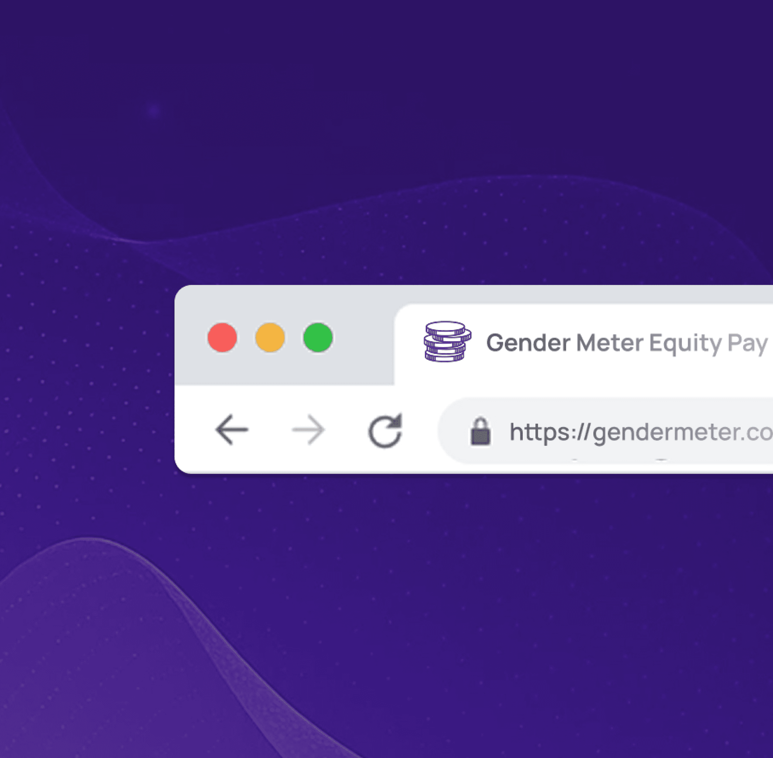
Gender Meter is a real-time, data-driven equity analytics platform that empowers organizations, investors, and policymakers to uncover, track, and close gender pay gaps. With automated insights and customizable dashboards, it helps build inclusive, transparent, and fair workplaces.
About
DEI (Diversity, Equity & Inclusion)
HR Tech
Fintech
Industry
Design System
Dashboard UI/UX
Accessibility Design
Illustration
Services
4 Months
Timeline

Objective was to enhance Gender Meter’s digital experience, enabling a powerful, intuitive platform that communicates gender equity insights with clarity—reinforcing their mission of transparency, inclusion, and data-backed change.
Gender Meter, despite offering powerful equity analytics, struggled with a digital presence that lacked emotional resonance, design consistency, and intuitive user journeys. The absence of a unified visual language and interactive storytelling made it difficult to convey the platform’s impact, especially to diverse stakeholders across tech and finance sectors.
This limited user engagement and diluted the platform’s ability to establish trust and authority in the DEI and HR tech space.
We implemented a comprehensive design transformation, building a modular, equity-centered design system for both web and mobile interfaces.
The solution focused on integrating data-driven storytelling with clean, futuristic aesthetics—grounded in accessibility, clarity, and inclusivity. By introducing dynamic visual elements, purposeful iconography, and frictionless user flows, we brought Gender Meter’s mission to life.
The result is a digital product that’s not only visually compelling, but also deeply trusted and easy to navigate for every user, from HR leaders to investors.
CHALLENGE
SOLUTION

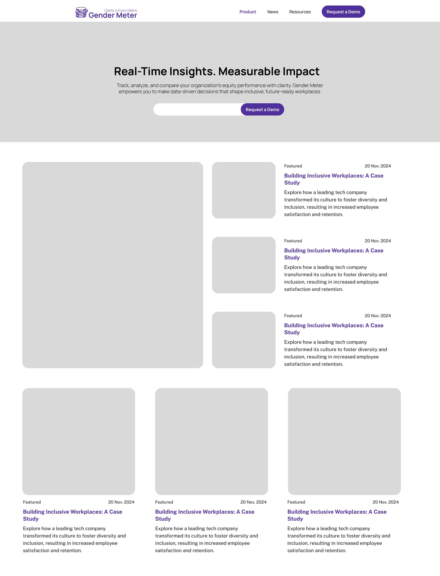
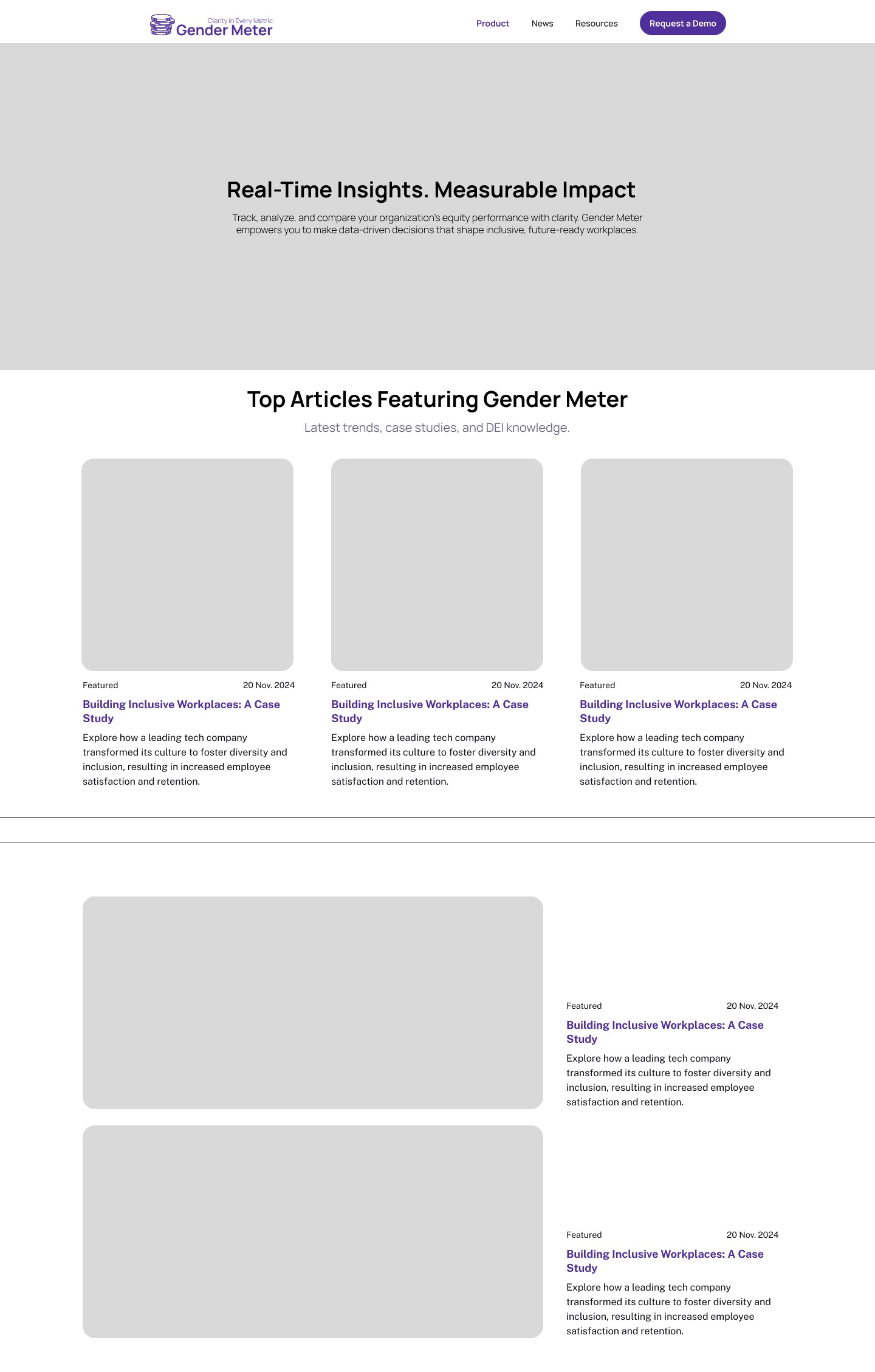
WireFrames
To lay a strong foundation for Gender Meter’s user experience, we crafted intuitive wireframes that aligned with the platform’s data-centric nature. These low-fidelity blueprints focused on clarity, accessibility, and strategic information flow—ensuring every element served a purpose.

Design System
The design system for Gender Meter was developed around its core brand palette — a confident Primary Purple paired with soft lavender accents and neutral grays. This cohesive system established clear guidelines across typography, spacing, layout, and UI components to ensure consistency and accessibility throughout the platform.
Typography choices were selected for clarity and modernity, contributing to a clean, data-driven visual experience. The visual language reinforced Gender Meter’s mission: making equity data intuitive, trustworthy, and actionable.
ABCDEFGHIJKLMNOPQRSTUVWXYZ
Typography
abcdefghijklmnopqrstuvwxyz
Manrope
Aa1
#4f309b
RGB: (79, 48, 155)
RGB: (194, 178, 229)
Purple Heart
RGB: (243, 243, 243)
#F3F3F3
Light Gray
#C2B2E5
Pastel Purple
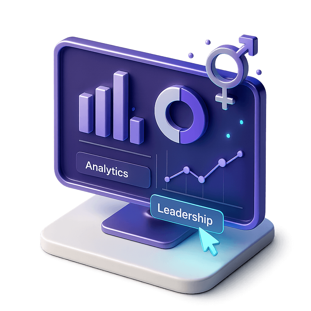
To convey the sophistication of Gender Meter’s financial analytics, we integrated high-fidelity 3D assets representing equity, transparency, and tech-forward insights.
Sleek, minimal forms—like scales, charts, and personas—added depth, clarity, and a modern, professional edge to the platform’s visual identity.
3D Assets
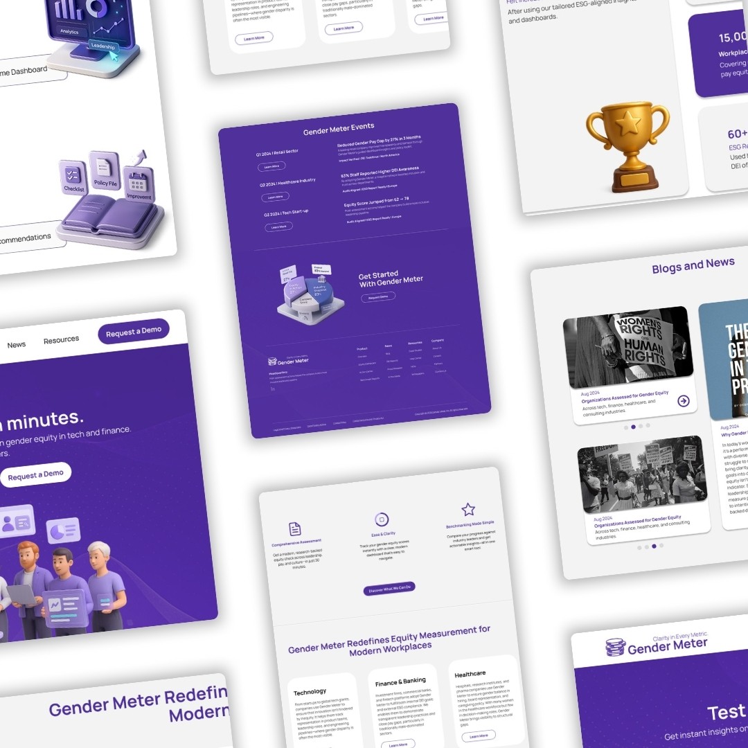


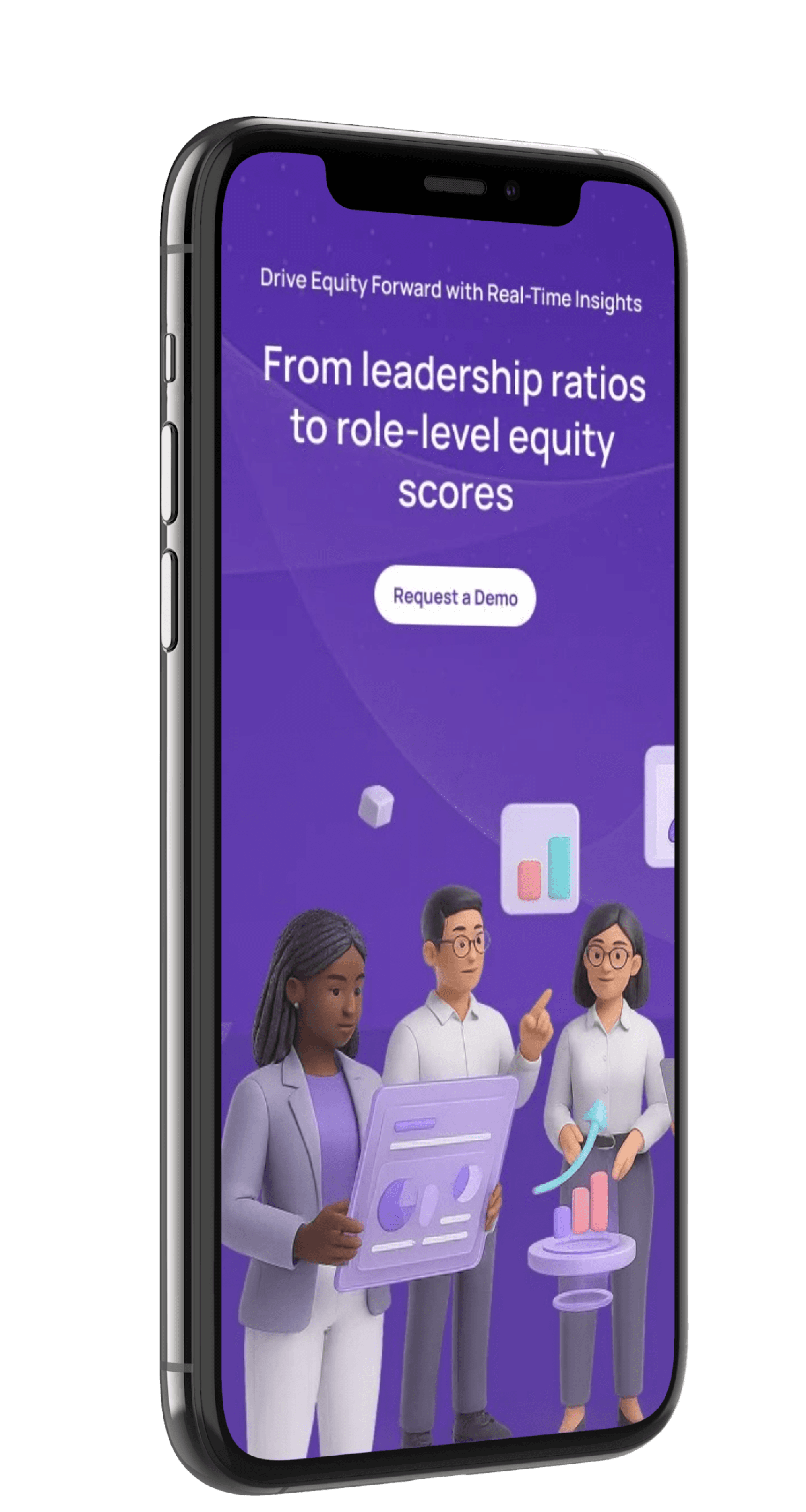
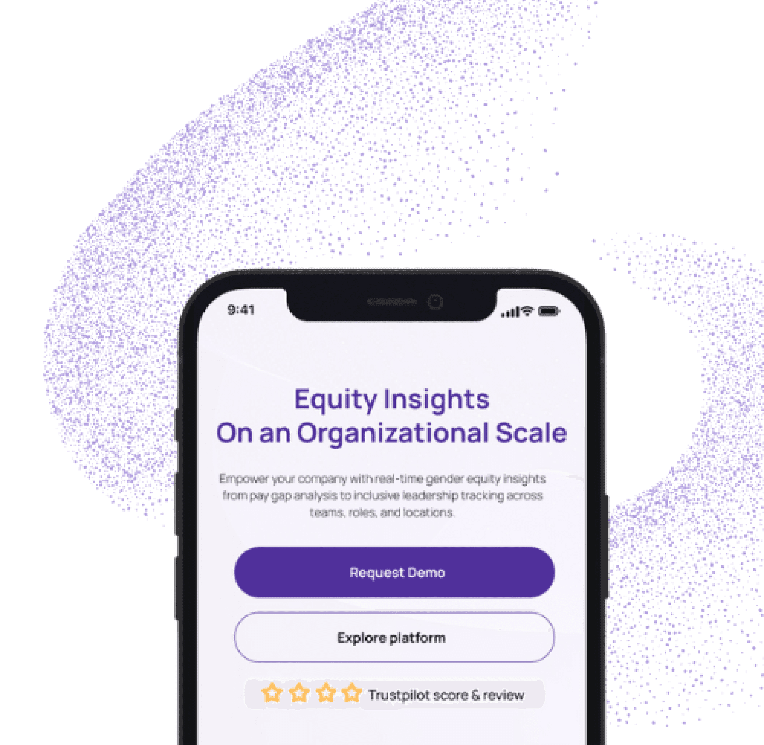
Gender Meter was designed to deliver a seamless experience across all screen sizes — from desktops to tablets and smartphones.
This responsive approach ensured that users, regardless of device, could easily access gender equity insights, explore dashboards, and interact with data without compromising usability or clarity.
Responsive Design
design iterations were explored to shape Gender Meter’s interface. This meticulous approach ensured the platform is bold, data-forward, and aligned with the mission of equity, clarity, and trust in financial analytics.
15+
Working on Gender Meter taught me that design isn’t just about how things look—it’s about what they make possible. Starting with deep research, I uncovered the invisible barriers people face in workplaces when it comes to equity. Translating those insights into a product meant learning how to simplify complexity without losing meaning.
I grew as a designer by learning to listen more, question better, and design not just for clarity, but for change. This project reminded me why I chose design in the first place: to make systems fairer, smarter, and more human.
Learning